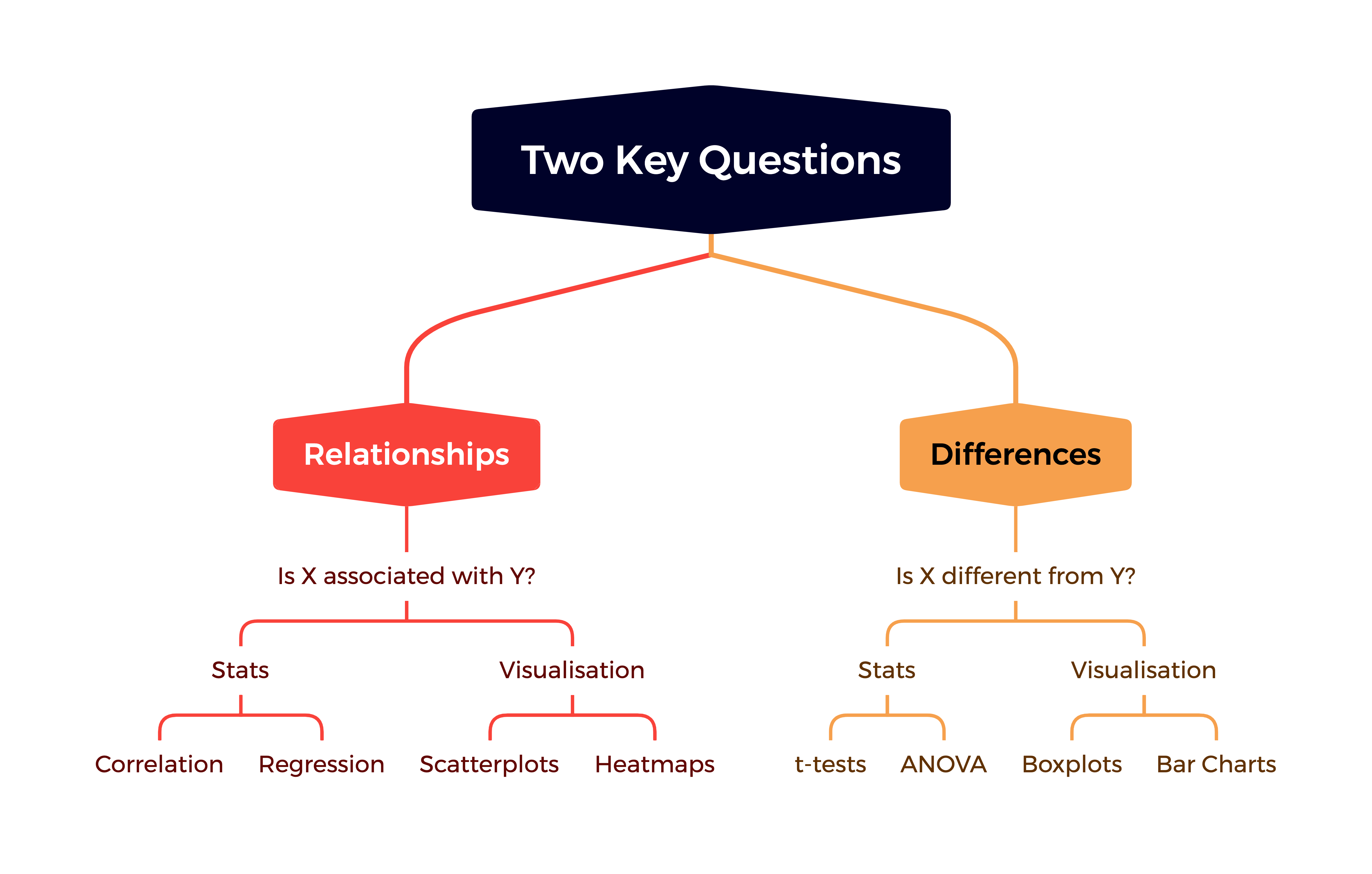
The goal of this session is to cover some basic techniques we can use to explore our data in terms of the relationships and differences between variables. We’ll also review the different types of variables that are encountered in sport data.
The pre-class reading for this week was fairly high-level, and introduced a series of techniques that we’ll cover in detail in Semester Two.
For now, we’ll focus on some simpler approaches to our data, which can still identify interesting and important features of our data. This will help us revise some concepts you should have covered at Undergraduate level, and learn how to implement these in R.
There is a fundamental assumption here that the relationships we identify in existing historical data will continue in the future. Therefore, while the approaches discussed below are primarily about identifying relationships or differences in the past, we may wish to use them to think about what might happen in the future.
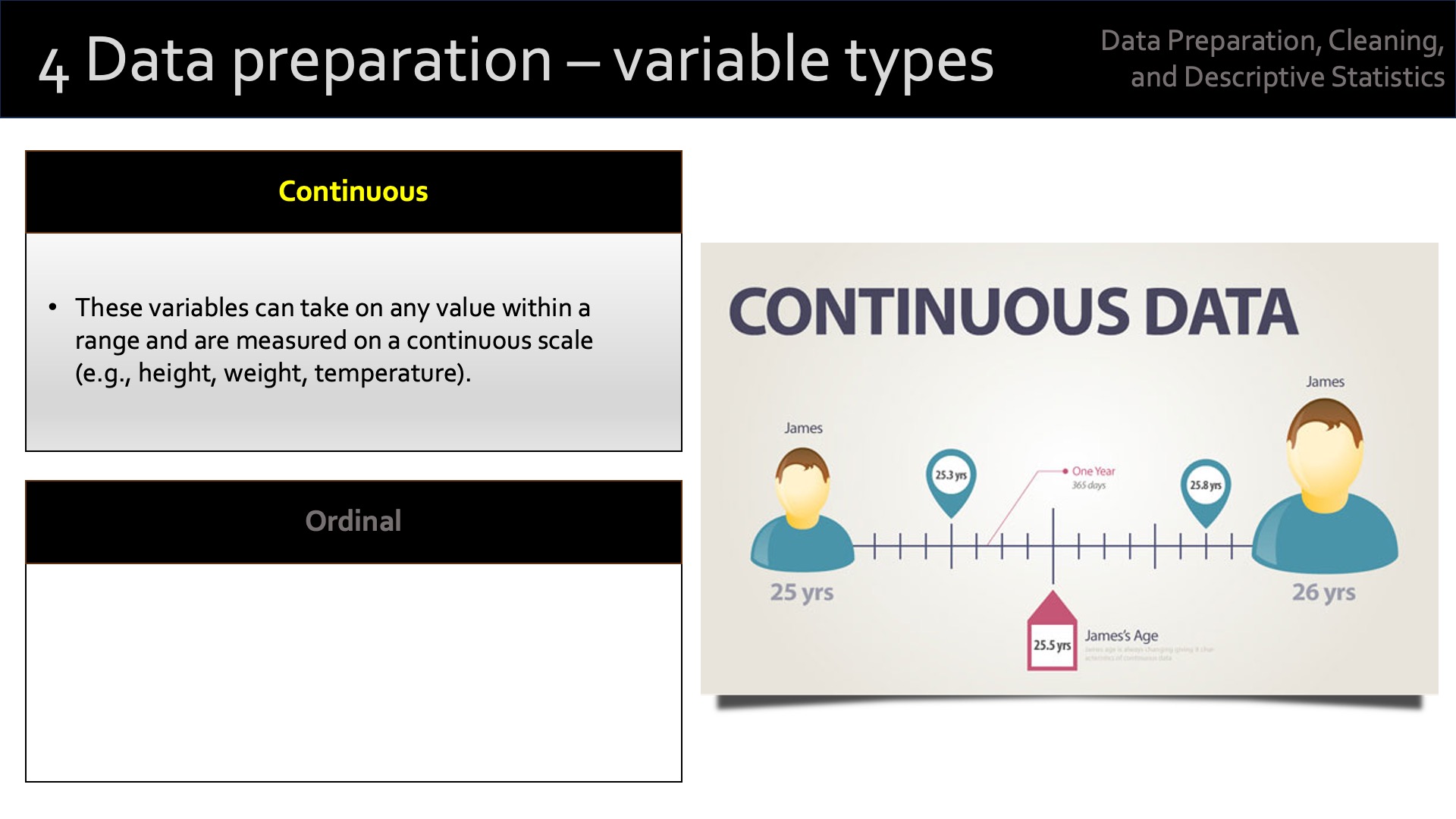
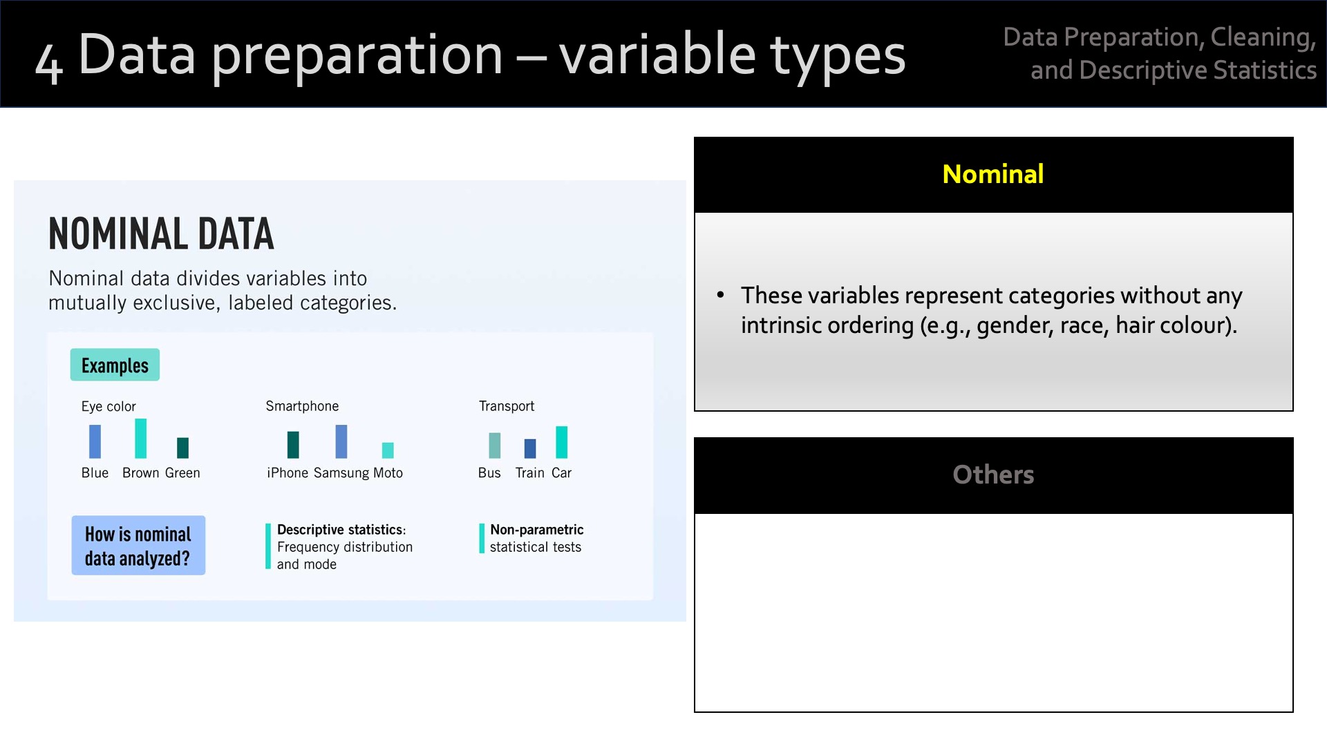
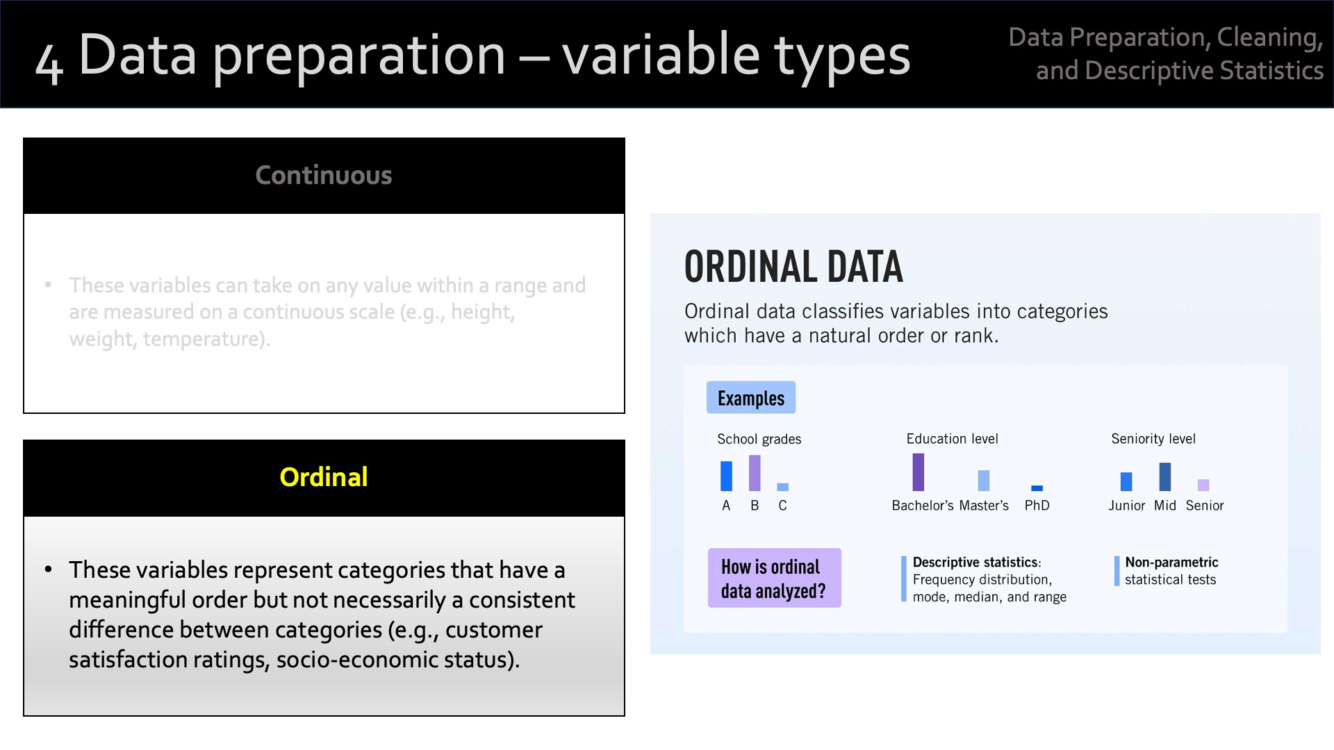
19.2 A recap of variable types
19.3 Demonstration - Exploring Relationships
I’m going to use create a dataset called [f1_data] related to Formula One.
I’ll examine the structure of my data before doing anything else:
head(f1_data)
  driver_age years_experience         team qualifying_position
1         34                6     Mercedes           11.850951
2         38               14 Aston Martin           13.886814
3         33                7 Aston Martin            4.111364
4         22               10     Red Bull           12.115860
5         29                5     Red Bull           19.817601
6         37                6 Aston Martin            3.402618
  constructor_championships podiums race_wins avg_race_finish
1                         2      24         1       14.872417
2                         1      52        19        9.040418
3                         2      33        17        7.116612
4                         2      29        10        9.056831
5                         0      16         7       11.349727
6                         5      25         8       13.936906
summary(f1_data)
   driver_age    years_experience     team           qualifying_position
 Min.   :20.00   Min.   : 1.00    Length:100         Min.   : 1.438
 1st Qu.:26.00   1st Qu.: 6.75    Class :character   1st Qu.: 6.859
 Median :31.00   Median :10.00    Mode  :character   Median :10.257
 Mean   :30.66   Mean   :10.49                       Mean   : 9.933
 3rd Qu.:35.00   3rd Qu.:14.00                       3rd Qu.:13.225
 Max.   :40.00   Max.   :20.00                       Max.   :19.838
 constructor_championships    podiums        race_wins     avg_race_finish
 Min.   :0.00              Min.   :10.00   Min.   : 1.00   Min.   : 1.000
 1st Qu.:1.00              1st Qu.:27.75   1st Qu.:10.00   1st Qu.: 6.881
 Median :2.00              Median :35.50   Median :13.00   Median : 8.562
 Mean   :2.35              Mean   :35.62   Mean   :13.17   Mean   : 8.591
 3rd Qu.:4.00              3rd Qu.:45.00   3rd Qu.:16.25   3rd Qu.:10.089
 Max.   :5.00              Max.   :68.00   Max.   :26.00   Max.   :15.688
19.3.1 Descriptive Statistics and Correlations
A good first step is to calculate some summary statistics and correlation between the continuous variables. This helps to understand the general trends and relationships.
# Descriptive statisticssummary(f1_data)
   driver_age    years_experience     team           qualifying_position
 Min.   :20.00   Min.   : 1.00    Length:100         Min.   : 1.438
 1st Qu.:26.00   1st Qu.: 6.75    Class :character   1st Qu.: 6.859
 Median :31.00   Median :10.00    Mode  :character   Median :10.257
 Mean   :30.66   Mean   :10.49                       Mean   : 9.933
 3rd Qu.:35.00   3rd Qu.:14.00                       3rd Qu.:13.225
 Max.   :40.00   Max.   :20.00                       Max.   :19.838
 constructor_championships    podiums        race_wins     avg_race_finish
 Min.   :0.00              Min.   :10.00   Min.   : 1.00   Min.   : 1.000
 1st Qu.:1.00              1st Qu.:27.75   1st Qu.:10.00   1st Qu.: 6.881
 Median :2.00              Median :35.50   Median :13.00   Median : 8.562
 Mean   :2.35              Mean   :35.62   Mean   :13.17   Mean   : 8.591
 3rd Qu.:4.00              3rd Qu.:45.00   3rd Qu.:16.25   3rd Qu.:10.089
 Max.   :5.00              Max.   :68.00   Max.   :26.00   Max.   :15.688
The summary() function provides basic summary statistics (mean, median, min, max) for the numeric variables.
The cor() function computes the correlation matrix, showing relationships between continuous variables like age, podium finishes, race wins, and more.
The correlation coefficient tells us the magnitude (size) of the relationship, and the direction of the relationship.
However, we have no way of knowing whether these relationships are significant or not. For that, we need to calculate the p-value for each correlation.
In the next example, I’ve used the correlation package to compute the correlation matrix with p-values, and get a SPSS/Stata-type output.
library(correlation)
Warning: package 'correlation' was built under R version 4.4.1
library(dplyr)
Attaching package: 'dplyr'
The following objects are masked from 'package:stats':

    filter, lag
The following objects are masked from 'package:base':

    intersect, setdiff, setequal, union
# Select only numeric columns using dplyrf1_numeric <- f1_data %>%select_if(is.numeric)# View the filtered data with only numeric columnsstr(f1_numeric)
There are more complex ways to do this in Base R. This example captures a number of techniques we’ve previously covered, and is useful for revision.
# Function to calculate correlation matrix with p-valuescor_with_p_values <-function(f1_data) {# Get the number of variables n <-ncol(f1_data)# Create empty matrices for correlations and p-values corr_matrix <-matrix(NA, n, n) p_matrix <-matrix(NA, n, n)# Loop over variable pairsfor (i in1:n) {for (j in1:n) { test <-cor.test(f1_data[, i], f1_data[, j]) corr_matrix[i, j] <- test$estimate # Correlation coefficient p_matrix[i, j] <- test$p.value # P-value } }# Return list with both correlation and p-value matriceslist(correlation = corr_matrix, p_values = p_matrix)}# Select relevant continuous variables from datasetcont_vars <- f1_data[, c("driver_age", "podiums", "years_experience", "race_wins", "avg_race_finish", "qualifying_position")]# Apply function to get correlation and p-value matricesresults <-cor_with_p_values(cont_vars)# Round results for better readabilitycorrelation_matrix <-round(results$correlation, 2)p_value_matrix <-round(results$p_values, 4) # Rounding p-values to 4 decimal places# Display resultscorrelation_matrix
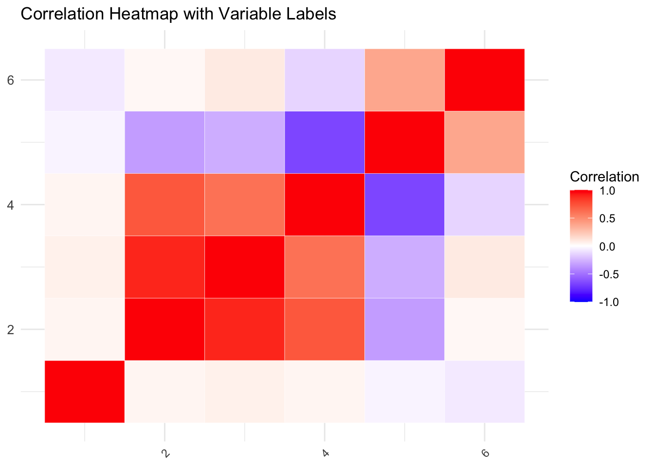
A correlation heatmap is a visual tool that makes it easier to interpret the relationships between variables. We can use ggplot2 and the reshape2 package in R to create one.
# Load necessary librarieslibrary(ggplot2)library(reshape2)# Reshape correlation matrix for visualizationmelted_corr <-melt(correlation_matrix)# Create the heatmap with variable labelsggplot(data = melted_corr, aes(x = Var1, y = Var2, fill = value)) +geom_tile(color ="white") +# Add white gridlines for better visibilityscale_fill_gradient2(low ="blue", high ="red", mid ="white", midpoint =0, limit =c(-1, 1), name ="Correlation") +theme_minimal() +theme(axis.text.x =element_text(angle =45, vjust =1, hjust =1), # Rotate x-axis labels for better fitaxis.text.y =element_text(size =10), # Adjust font size for y-axis labelsaxis.title.x =element_blank(), # Remove axis titles for clean lookaxis.title.y =element_blank()) +ggtitle("Correlation Heatmap with Variable Labels") +# Add a titlelabs(x ="Variables", y ="Variables")
This code creates a heatmap that visually represents the correlation matrix.
Strong positive correlations are represented in red
Negative correlations in blue
Weak correlations near zero are in white.
This gives a quick visual summary of the relationships between variables.
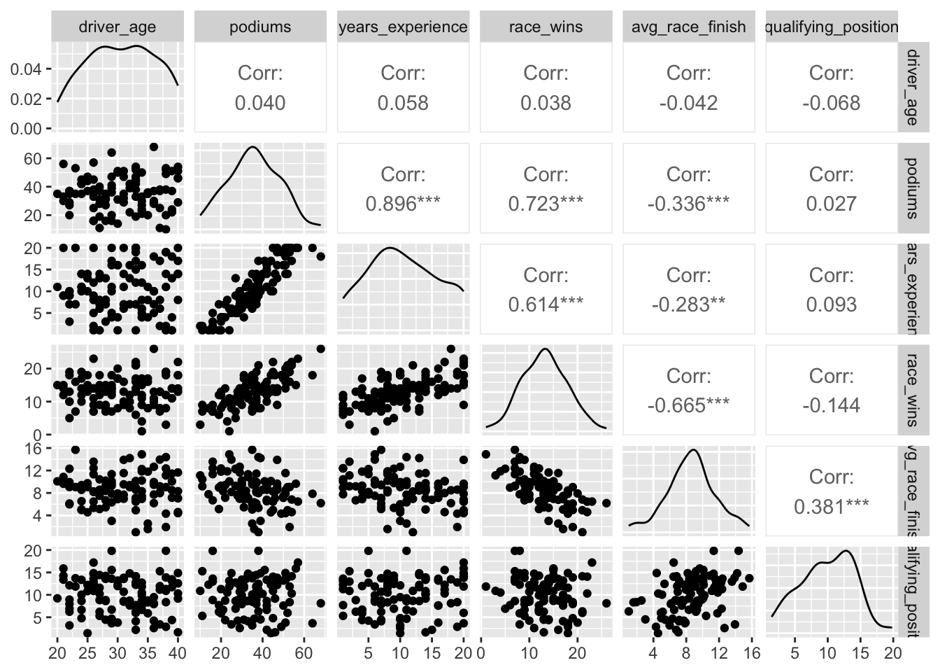
A pair plot, or scatterplot matrix, is another way to visualise the relationships between multiple variables at once. It creates scatterplots for each pair of variables, along with histograms for individual variables on the diagonal.
In this example, I’ve used the GGally library to create the plots.
# Load librarylibrary(GGally)
Registered S3 method overwritten by 'GGally':
  method from
  +.gg   ggplot2
The ggpairs() function from the GGally package creates a grid of scatterplots, which makes it easy to visually explore pairwise relationships between continuous variables. This plot includes scatterplots for each pair and histograms for the distribution of individual variables along the diagonal.
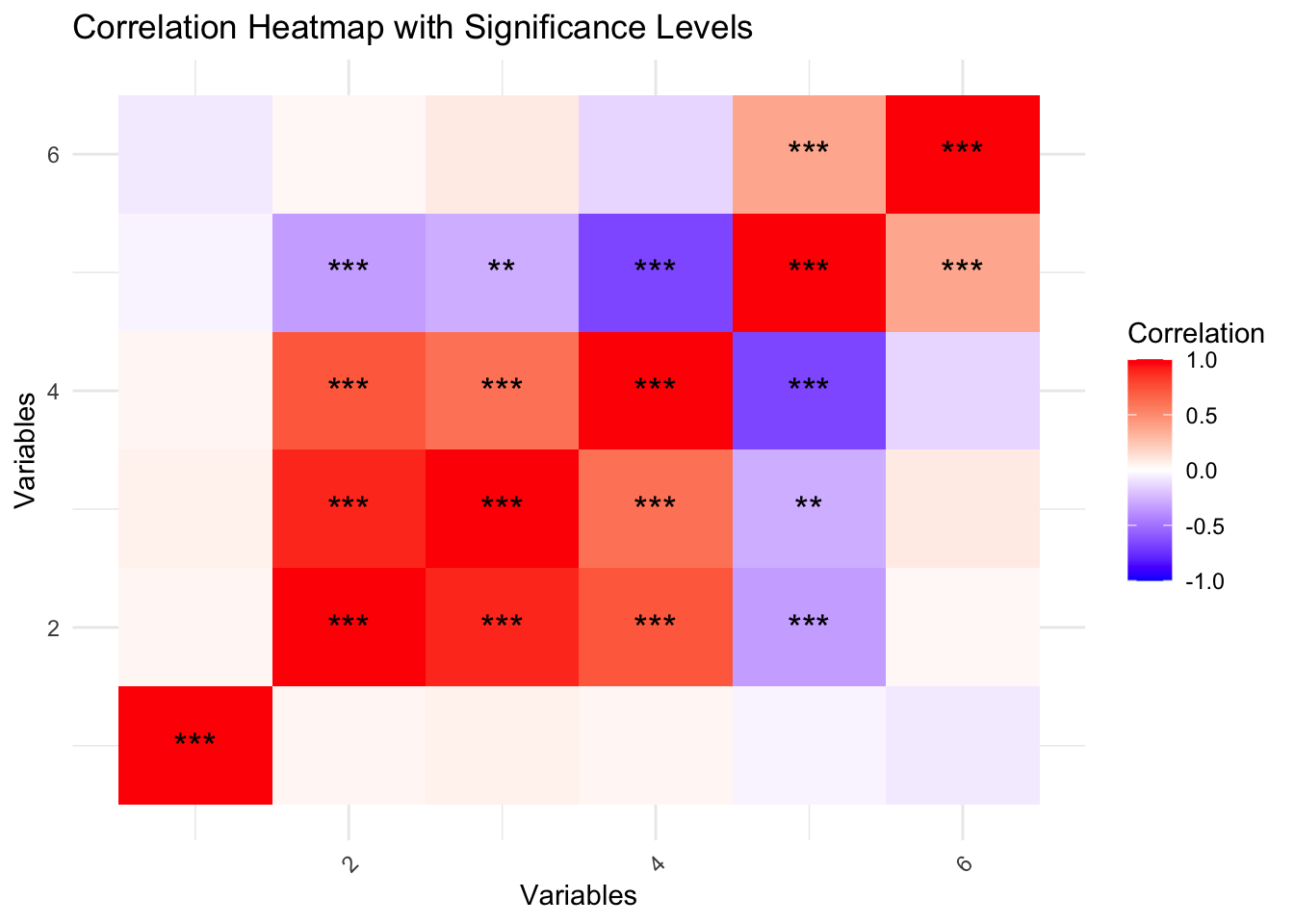
19.3.1.3 Significance of Correlations: Visualising Significant Correlations with Stars
We can enhance the heatmap by marking correlations that are statistically significant. Significant correlations can be highlighted with stars or different colors based on the p-values.
# Prepare data for heatmap with significance starsmelted_corr_with_p <-melt(correlation_matrix)melted_p_value <-melt(p_value_matrix)# Add significance levels to the plotmelted_corr_with_p$significance <-cut(melted_p_value$value, breaks =c(-Inf, 0.001, 0.01, 0.05, Inf),labels =c("***", "**", "*", ""))# Plot heatmap with significance levelsggplot(data = melted_corr_with_p, aes(x = Var1, y = Var2, fill = value)) +geom_tile() +geom_text(aes(label = significance), color ="black", size =5) +scale_fill_gradient2(low ="blue", high ="red", mid ="white", midpoint =0, limit =c(-1, 1), name ="Correlation") +theme_minimal() +theme(axis.text.x =element_text(angle =45, vjust =1, hjust =1)) +ggtitle("Correlation Heatmap with Significance Levels") +labs(x ="Variables", y ="Variables")
This enhanced heatmap highlights statistically significant correlations with stars. The number of stars indicates the significance level (*** for p < 0.001, ** for p < 0.01, and * for p < 0.05). This visualisation helps quickly identify both the strength and statistical significance of correlations between variables.
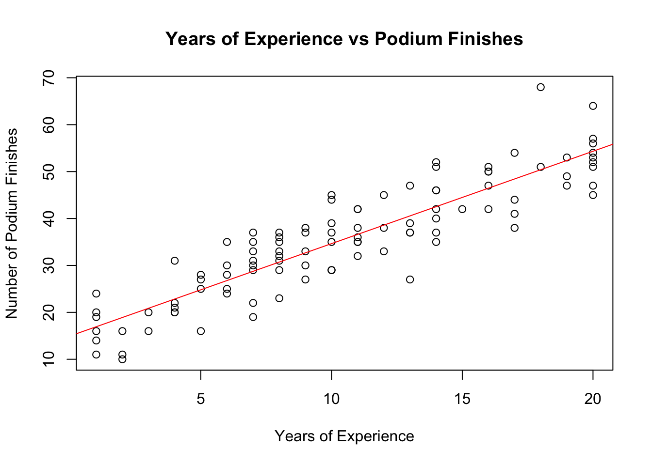
19.3.2 Scatterplots to Visualise Relationships
Scatterplots are useful for visualising relationships between two continuous variables. Let’s explore the relationship between years of experience and podium finishes.
# Scatterplot: Years of Experience vs Podiumsplot(f1_data$years_experience, f1_data$podiums,xlab ="Years of Experience",ylab ="Number of Podium Finishes",main ="Years of Experience vs Podium Finishes")abline(lm(podiums ~ years_experience, data = f1_data), col ="red") # Add trendline
This scatterplot helps visualise the relationship between experience and podium finishes. The red line is a linear trendline that indicates any general trend (positive, negative, or no relationship).
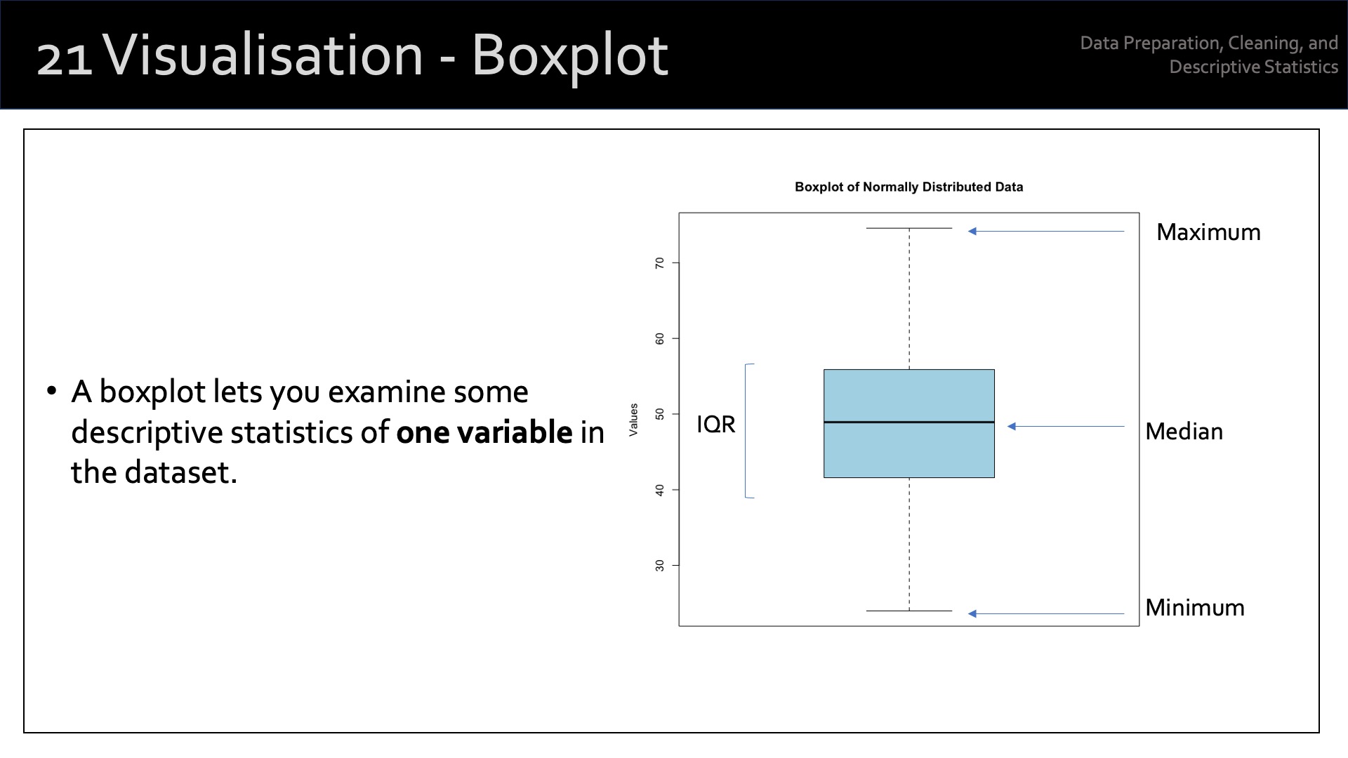
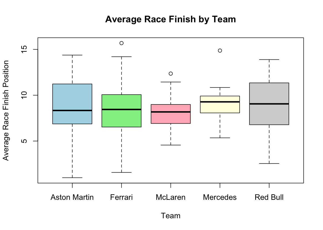
19.3.3 Boxplots to Compare Groups
Boxplots allow us to compare distributions across different categories.
Here, we’ll compare the average race finish by team.
# Boxplot: Average Race Finish by Teamboxplot(avg_race_finish ~ team,data = f1_data,main ="Average Race Finish by Team",xlab ="Team",ylab ="Average Race Finish Position",col =c("lightblue", "lightgreen", "lightpink", "lightyellow", "lightgray"))
This boxplot shows how the average race finish position differs by team. We can see which teams tend to have higher or lower finishing positions on average.
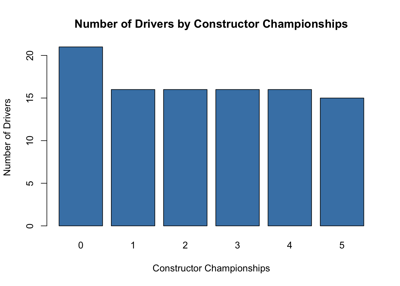
19.3.4 Bar Charts for Categorical Variables
A bar chart is a simple but effective way to summarise categorical data.
Here, we’ll plot the number of drivers by constructor championships.
# Bar chart: Constructor Championshipsbarplot(table(f1_data$constructor_championships),main ="Number of Drivers by Constructor Championships",xlab ="Constructor Championships",ylab ="Number of Drivers",col ="steelblue")
This bar chart shows the distribution of drivers across different constructor championship counts. It’s a straightforward way to understand the frequency of a categorical variable.
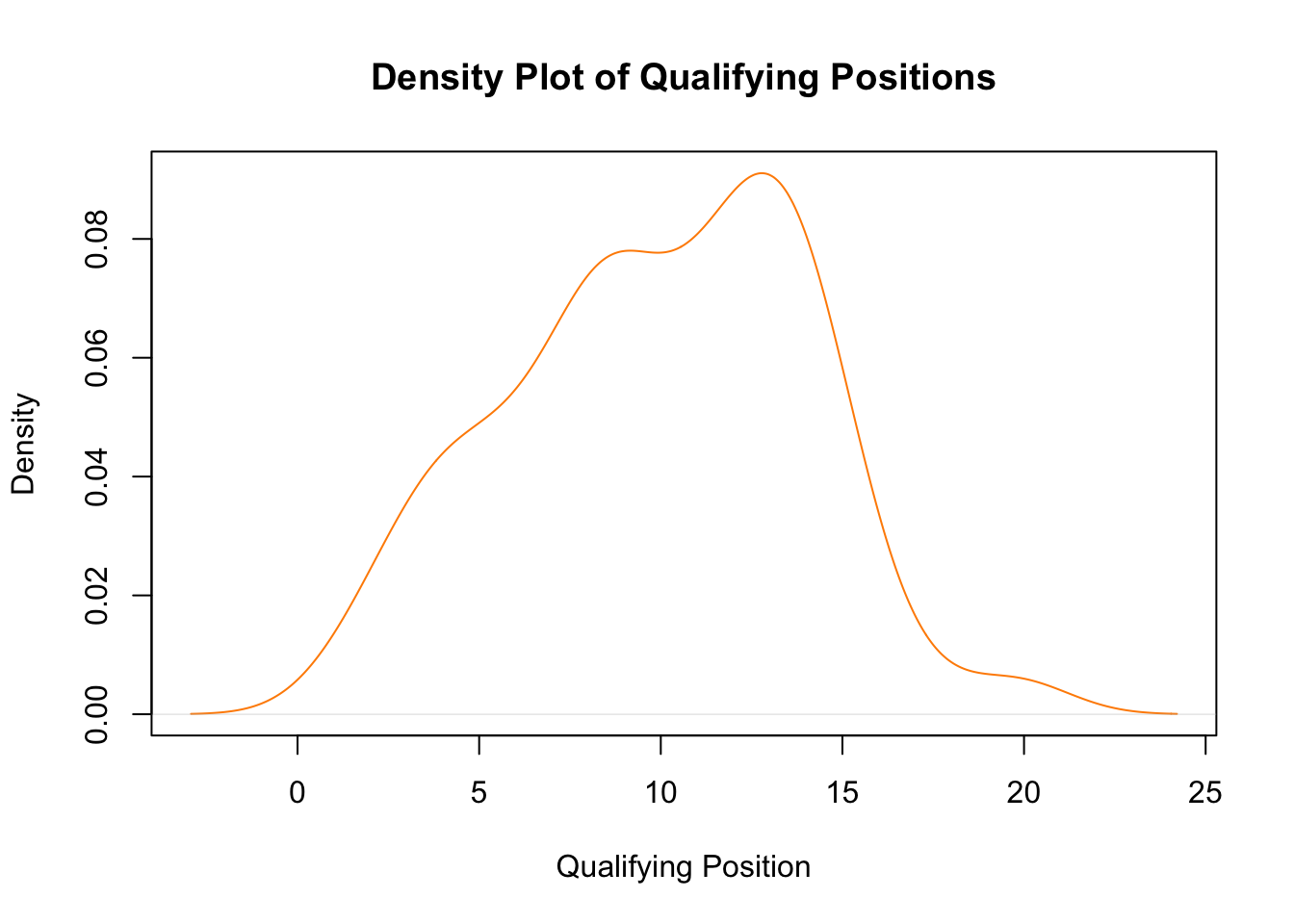
19.3.5 Density Plot for Continuous Variables
Density plots give us a smooth estimate of the distribution of a continuous variable. Let’s visualize the distribution of qualifying positions.
# Density plot: Qualifying Positionplot(density(f1_data$qualifying_position),main ="Density Plot of Qualifying Positions",xlab ="Qualifying Position",col ="darkorange")
This density plot shows the distribution of qualifying positions. It helps in identifying where most qualifying times fall and whether the data is skewed.
19.3.6 Chi-Square Test for Categorical Variables
If we want to check the association between two categorical variables, like team and constructor championships, we can use a chi-square test.
# Chi-square test: Team vs Constructor Championshipschisq_test <-chisq.test(table(f1_data$team, f1_data$constructor_championships))
Warning in chisq.test(table(f1_data$team, f1_data$constructor_championships)):
Chi-squared approximation may be incorrect
The chi-square test assesses whether there is a significant association between team and the number of constructor championships. If the p-value is low, it suggests there is an association.
19.3.7 Multiple Linear Regression
Finally, we can use multiple linear regression to understand how multiple variables affect one outcome. For example, we can model how years of experience and team affect the number of podium finishes.
# Multiple linear regression: Predicting Podium Finishesmodel <-lm(podiums ~ years_experience + team + race_wins + avg_race_finish, data = f1_data)summary(model)
Call:
lm(formula = podiums ~ years_experience + team + race_wins +
    avg_race_finish, data = f1_data)

Residuals:
     Min       1Q   Median       3Q      Max
-11.0261  -3.5254  -0.2822   3.2439  11.0097

Coefficients:
                 Estimate Std. Error t value Pr(>|t|)
(Intercept)        4.8784     3.4984   1.394    0.167
years_experience   1.5741     0.1111  14.174  < 2e-16 ***
teamFerrari        0.6708     1.5169   0.442    0.659
teamMcLaren       -1.2811     1.5605  -0.821    0.414
teamMercedes       0.1499     1.4608   0.103    0.919
teamRed Bull      -2.2194     1.3586  -1.634    0.106
race_wins          0.8874     0.1709   5.191 1.24e-06 ***
avg_race_finish    0.3664     0.2240   1.636    0.105
---
Signif. codes:  0 '***' 0.001 '**' 0.01 '*' 0.05 '.' 0.1 ' ' 1

Residual standard error: 4.699 on 92 degrees of freedom
Multiple R-squared:  0.8637,    Adjusted R-squared:  0.8533
F-statistic: 83.29 on 7 and 92 DF,  p-value: < 2.2e-16
This linear model looks at how experience, team, race wins, and average race finish predict the number of podium finishes. The summary() output provides detailed information about the significance and coefficients of the model.
We’ll cover linear regression in greater detail later in the module.
19.4 Demonstration - Exploring Differences
Exploring differences between variables involves comparing groups or distributions to see whether the observed differences are statistically significant and meaningful.
Here, I’ll introduce a few techniques for exploring these differences using both statistical and visual approaches. I’ll include examples for continuous and categorical variables.
19.4.1 Statistical Approaches for Exploring Differences
19.4.1.1 T-Test (for Continuous Variables Between Two Groups)
A t-test is used to compare the means of two groups for a continuous variable. It checks whether the difference between the group means is statistically significant.
For example, we might want to testing if the average number of podium finishes differs significantly between two Formula One teams (e.g., “Mercedes” and “Red Bull”).
# Subset data for two teamsteam_data <- f1_data[f1_data$team %in%c("Mercedes", "Red Bull"), ]# Conduct t-test to compare the average number of podiums between two teamst_test_result <-t.test(podiums ~ team, data = team_data)t_test_result
    Welch Two Sample t-test

data:  podiums by team
t = 0.82027, df = 41.143, p-value = 0.4168
alternative hypothesis: true difference in means between group Mercedes and group Red Bull is not equal to 0
95 percent confidence interval:
 -4.000684  9.474368
sample estimates:
mean in group Mercedes mean in group Red Bull
              36.73684               34.00000
The t-test provides a p-value, which tells us if the observed difference between the two group means (in this case, podium finishes) is statistically significant. A p-value below 0.05 typically indicates significance.
19.4.1.2 ANOVA (for Continuous Variables Between More Than Two Groups)
ANOVA (Analysis of Variance) is used to compare the means of a continuous variable across more than two groups.
For example, we might want to compare the average number of podiums among drivers from multiple teams.
# Conduct one-way ANOVA to compare podiums across different teamsanova_result <-aov(podiums ~ team, data = f1_data)summary(anova_result)
            Df Sum Sq Mean Sq F value Pr(>F)
team         4    536   134.0   0.886  0.475
Residuals   95  14367   151.2
The ANOVA test gives a p-value to indicate whether there is a statistically significant difference in the means of podiums across the different teams.
19.4.1.3 Chi-Square Test (for Categorical Variables)
The chi-square test is used to determine if there is a significant association between two categorical variables.
For example, we might want to test whether [constructor championships] and [team] are related.
# Conduct chi-square test to assess association between team and constructor championshipschisq_test_result <-chisq.test(table(f1_data$team, f1_data$constructor_championships))
Warning in chisq.test(table(f1_data$team, f1_data$constructor_championships)):
Chi-squared approximation may be incorrect
The chi-square test provides a p-value that indicates whether there is a statistically significant association between the two categorical variables (in this case, [team] and [constructor championships]).
19.4.2 Visual Approaches for Exploring Differences
19.4.2.1 Boxplots (for Continuous Variables Across Groups)
Boxplots are useful for visualising the distribution of a continuous variable across different categories or groups. You can compare the medians, interquartile ranges (IQRs), and potential outliers.
For example, we might want to compare podium finishes across different teams.
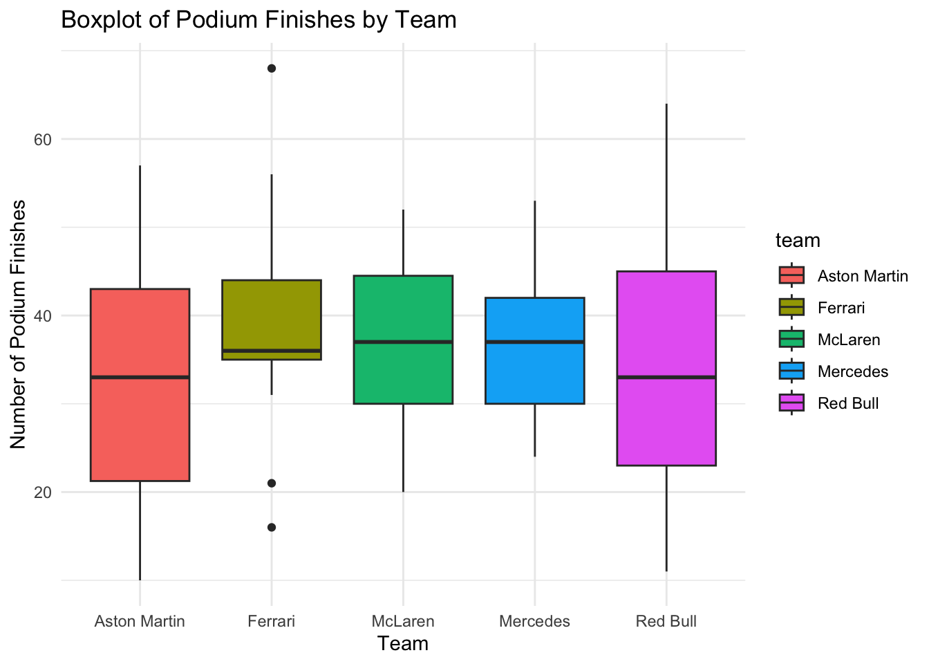
# Boxplot: Podiums by Teamggplot(f1_data, aes(x = team, y = podiums, fill = team)) +geom_boxplot() +theme_minimal() +ggtitle("Boxplot of Podium Finishes by Team") +xlab("Team") +ylab("Number of Podium Finishes")
Boxplots provide a visual comparison of the spread and central tendency (median) of the data across different teams, allowing us to see the differences in podium finishes.
19.4.2.2 Violin Plots (for Continuous Variables Across Groups)
Violin plots combine boxplots and density plots, providing a visual comparison of the distribution of a continuous variable across different groups, along with the probability density.
For example, we might want to visualise the distribution of race wins across different teams.
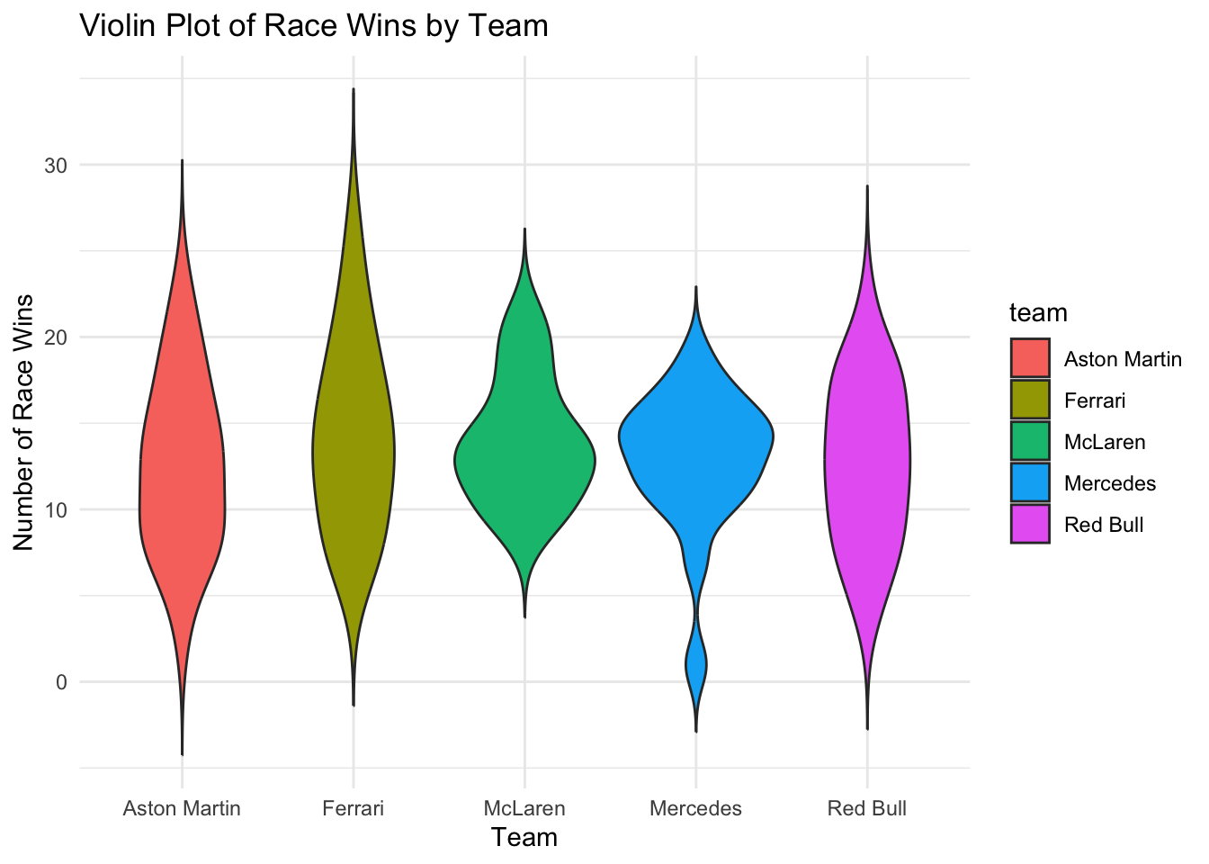
# Violin Plot: Race Wins by Teamggplot(f1_data, aes(x = team, y = race_wins, fill = team)) +geom_violin(trim =FALSE) +theme_minimal() +ggtitle("Violin Plot of Race Wins by Team") +xlab("Team") +ylab("Number of Race Wins")
The violin plot shows both the spread (via the width of the plot) and the density of race wins across different teams, helping to visualise differences between groups.
19.4.2.3 Bar Charts (for Categorical Variables)
Bar charts are great for comparing the frequency of categories or groups. They are particularly useful when comparing categorical variables.
For example, we might want to compare the number of drivers by team.
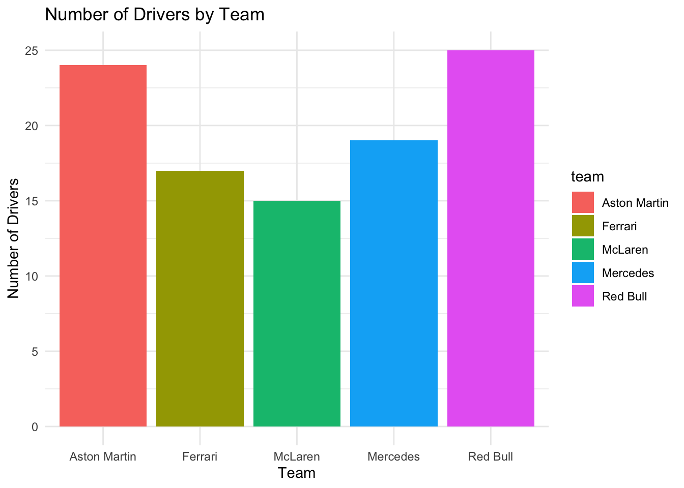
# Bar Chart: Drivers by Teamggplot(f1_data, aes(x = team, fill = team)) +geom_bar() +theme_minimal() +ggtitle("Number of Drivers by Team") +xlab("Team") +ylab("Number of Drivers")
This bar chart provides a quick comparison of the number of drivers in each team, helping to explore differences in the frequency of categorical variables.
19.4.2.4 Histograms (for Comparing Distributions of Continuous Variables)
Histograms are used to show the distribution of a continuous variable. We can overlay histograms for different groups to compare their distributions.
For example, we might want to compare the distribution of average race finishes between two teams.
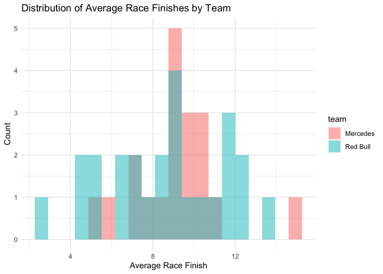
# Subset data for two teamsteam_data <- f1_data[f1_data$team %in%c("Mercedes", "Red Bull"), ]# Histogram: Comparing race finish distributions between two teamsggplot(team_data, aes(x = avg_race_finish, fill = team)) +geom_histogram(position ="identity", alpha =0.5, bins =20) +theme_minimal() +ggtitle("Distribution of Average Race Finishes by Team") +xlab("Average Race Finish") +ylab("Count")
This histogram overlays the distributions of average race finishes for “Mercedes” and “Red Bull” drivers, allowing us to visually compare their performance differences.
19.5 Practical - Exploring Relationships and Differences
Compare the average number of tries scored between players in the “Forward” and “Back” positions.
Use a t-test to determine if there is a statistically significant difference between the two groups.
Hint: Use the t.test() function.
Show solution
# T-Test: Compare tries scored between Forwards and Backst_test_result <-t.test(tries_scored ~ position, data = rugby_data)t_test_result
19.5.2 Conduct a One-Way ANOVA
Compare the average number of tackles made across players in “Team A”, “Team B”, and “Team C”. Use a one-way ANOVA to determine if there is a statistically significant difference in tackles made between the teams.
Hint: Use the aov() function.
Show solution
# One-Way ANOVA: Compare tackles made across teamsanova_result <-aov(tackles_made ~ team, data = rugby_data)summary(anova_result)
19.5.3 Conduct a Chi-Square Test
Test whether there is a significant association between the player position (Forward/Back) and the fitness level (ordinal variable, 1 to 5). Use a chi-square test.
Hint: Use the table() function to create a contingency table and the chisq.test() function for the test.
Show solution
# Chi-Square Test: Association between position and fitness levelchisq_test_result <-chisq.test(table(rugby_data$position, rugby_data$fitness_level))chisq_test_result
19.5.4 Create a Boxplot
Visualise the distribution of tackles made across the different positions (“Forward” and “Back”) using a boxplot. This will help you compare the central tendency and spread of tackles made for each position.
Hint: Use ggplot2 and geom_boxplot().
Show solution
# Boxplot: Tackles made by positionlibrary(ggplot2)ggplot(rugby_data, aes(x = position, y = tackles_made, fill = position)) +geom_boxplot() +theme_minimal() +ggtitle("Boxplot of Tackles Made by Position") +xlab("Position") +ylab("Number of Tackles Made")
19.5.5 Create a Violin Plot
Create a violin plot to visualize the distribution of tries scored across the different teams (“Team A”, “Team B”, “Team C”). The violin plot should show both the distribution shape and the spread of tries scored.
Hint: Use geom_violin().
Show solution
# Violin Plot: Tries scored by teamggplot(rugby_data, aes(x = team, y = tries_scored, fill = team)) +geom_violin(trim =FALSE) +theme_minimal() +ggtitle("Violin Plot of Tries Scored by Team") +xlab("Team") +ylab("Number of Tries Scored")
19.5.6 Create a Bar Chart
Create a bar chart to compare the number of players by fitness level across the dataset. This chart will help you see the distribution of players across the different fitness levels (1 to 5).
Hint: Use geom_bar().
Show solution
# Bar Chart: Players by Fitness Levelggplot(rugby_data, aes(x =as.factor(fitness_level), fill =as.factor(fitness_level))) +geom_bar() +theme_minimal() +ggtitle("Number of Players by Fitness Level") +xlab("Fitness Level") +ylab("Number of Players")
19.5.7 Conduct a Correlation Analysis
Explore the relationships between continuous variables, such as player age, years of experience, tries scored, tackles made, and injuries sustained. Compute the correlation matrix and visualise it using a heatmap.
Hint: Use the cor() function for the correlation matrix and ggplot2 to visualise it.
Show solution
# Correlation matrix for continuous variablescor_matrix <-cor(rugby_data[, c("player_age", "years_experience", "tries_scored", "tackles_made", "injuries_sustained")])# Reshape correlation matrix for heatmapmelted_corr <-melt(cor_matrix)# Create heatmapggplot(melted_corr, aes(x = Var1, y = Var2, fill = value)) +geom_tile(color ="white") +scale_fill_gradient2(low ="blue", high ="red", mid ="white", midpoint =0, limit =c(-1, 1), name ="Correlation") +theme_minimal() +theme(axis.text.x =element_text(angle =45, hjust =1)) +ggtitle("Correlation Heatmap of Continuous Variables")
19.5.8 Create a Histogram
Visualise the distribution of player ages in the dataset using a histogram. This will help you understand how player ages are distributed across the dataset.
Hint: Use geom_histogram().
Show solution
# Histogram: Distribution of player ageggplot(rugby_data, aes(x = player_age)) +geom_histogram(binwidth =2, fill ="blue", color ="black") +theme_minimal() +ggtitle("Distribution of Player Age") +xlab("Player Age") +ylab("Count")
19.6 Extension Task
The following task is best completed in pairs. See how far you can go with it…it’s a good test of everything we’ve covered to this point in the module (including the pre-class reading for this week!)
Step 1: Load the [sport_data.csv] file into R using the appropriate import function.
Step 2: Inspect the first few rows and structure of the dataset (head(), str(), summary()).
Step 3: Check for any issues like incorrectly formatted columns (e.g., [is_foreign] should be a factor, not numeric).
Checklist:
Is the dataset successfully imported?
Do you understand the structure of the data?
19.6.1.2 Handle Missing Data
Step 1: Use is.na() to identify missing values across all columns.
Step 2: Decide whether to remove rows/columns with missing data or impute them. If imputing (assuming you know what this is), choose a method (mean, median, or predictive model).
Step 3: Implement your chosen approach in the R script and provide a justification in comments.
Checklist:
You’ve identified and addressed missing data?
You can provide a justification for your method of handling missing values?
19.6.1.3 Identify Outliers
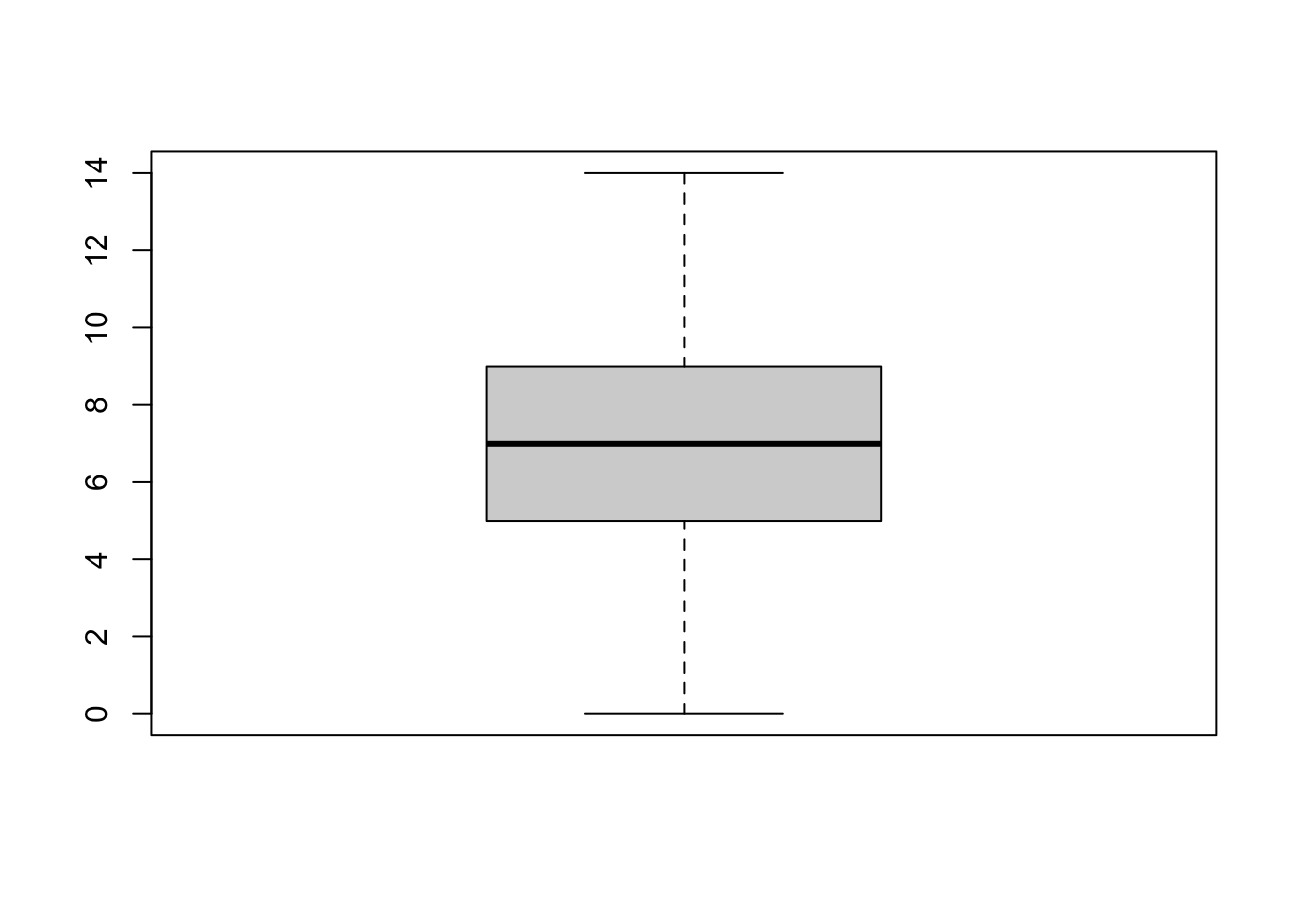
Step 1: Use boxplots (ggplot2 or boxplot()) to visually identify outliers in the goals, assists, market_value, and salary columns.
Step 2: Choose a method to handle the outliers (e.g., removal, capping at a certain quantile, or leaving them).
Step 3: Implement the changes in R and justify your decision with comments.
Checklist:
Any outliers identified visually?
You’ve handled outliers appropriately and provided reasoning?
19.6.1.4 Modify Data
Step 1: Create a new variable [efficiency], defined as [goals] / [minutes_played].
Step 2: Remove columns that you deem unnecessary for further analysis (e.g., [contract_length], [team_performance]). Justify your choice.
Step 3: Rename or reorder columns if needed for clarity.
Checklist:
A new [efficiency] variable created?
All unnecessary columns removed, with reasoning provided?
19.6.2 Part 2: Descriptive Statistics and Visualisations
19.6.2.1 Descriptive Statistics
Step 1: Use summary() to generate basic descriptive statistics (mean, median, standard deviation) for goals, assists, minutes_played, market_value, and salary.
Step 2: Note any unusual or interesting insights from the descriptive statistics. For example, are the distributions skewed?
Checklist:
Descriptive statistics are calculated?
Any significant insights are noted?
19.6.2.2 Data Visualisation
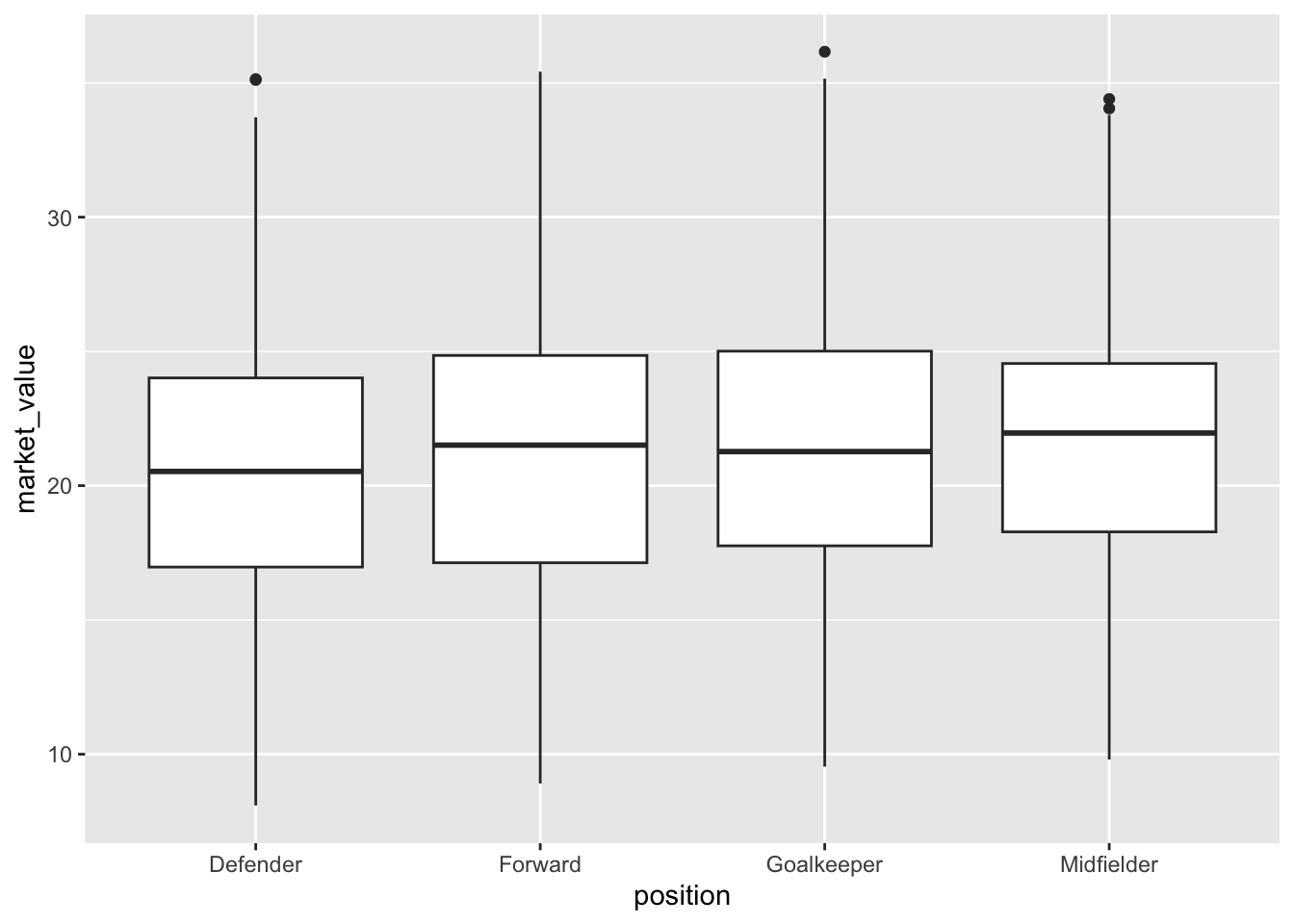
Step 1: Create a boxplot comparing player market_value across different positions. (ggplot2::geom_boxplot())
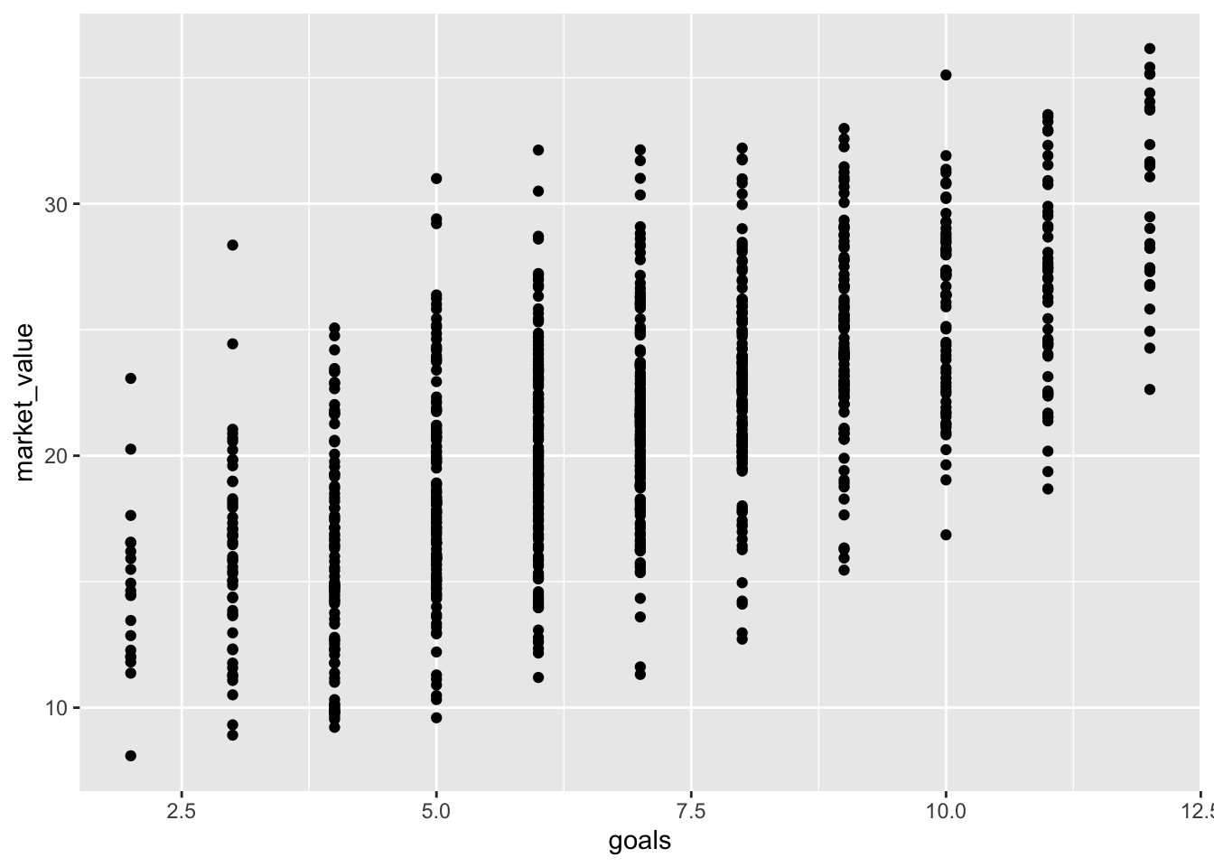
Step 2: Create a scatter plot showing the relationship between goals and market_value.
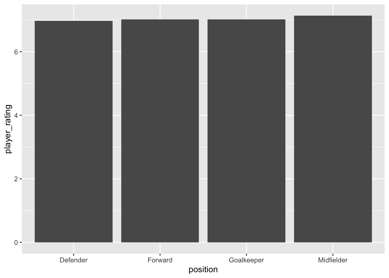
Step 3: Create a bar chart showing the average [player_rating] for each position.
Checklist:
Boxplot created and differences between positions are visualised?
Scatter plot created to show the relationship between [goals] and [market_value]?
Bar chart has been created showing average player ratings by position?
19.6.2.3 Exploratory Data Analysis
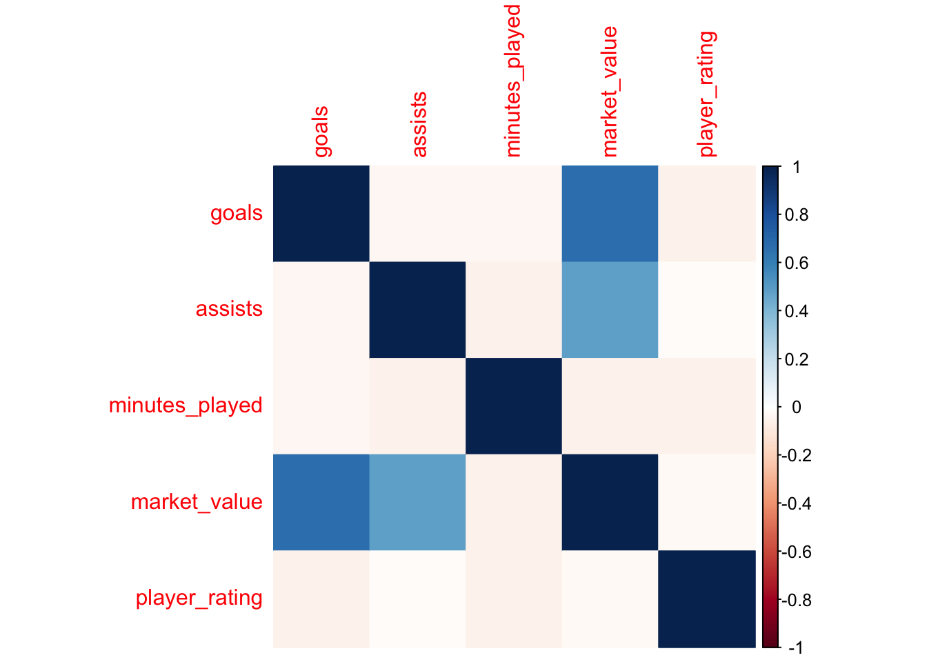
Step 1: Use cor() to calculate correlations between numerical variables (goals, assists, minutes_played, market_value, etc.).
Step 2: Visualise the correlations using a heatmap (corrplot or ggplot2).
Step 3: Discuss any interesting or unexpected strong/weak correlations.
Checklist:
A correlation matrix calculated?
A heatmap of these relationships visualised?
Any significant correlations discussed?
19.6.3 Part 3: Predictive Analysis
19.6.3.1 Predictive Model: Player Market Value
Step 1: Split the dataset into training and test sets (e.g., 80/20 split using sample.split() from the caTools package).
Step 2: Build a linear regression model (lm()) to predict market_value based on goals, assists, minutes_played, age, player_rating, and position.
Step 3: Evaluate the model using performance metrics like R-squared and RMSE (summary() and Metrics::rmse()).
Step 4: Test the model on the holdout test set and compare its performance to the training set.
Checklist:
Model built and tested on both training and test sets?
You’ve evaluated the model’s performance using R-squared and RMSE?
You’ve commented on whether the model generalises well?
19.6.3.2 Classification Model: Foreign vs Domestic Players
Step 1: Build a logistic regression model (glm()) to classify whether a player is foreign (is_foreign) based on their performance statistics (goals, assists, minutes_played, age, market_value, player_rating). Step 2: Evaluate the model’s accuracy using a confusion matrix (caret::confusionMatrix()). Step 3: Calculate accuracy, precision, recall, and F1 score for model evaluation.
Checklist:
A logistic regression model has been built and evaluated?
A confusion matrix created?
Your model’s precision, recall, and F1 score calculated?
19.6.4 Part 3: Stretch Challenge
19.6.4.1 Advanced Data Manipulation
Step 1: Create a new column [high_performer], where a player is flagged as 1 if they meet all of the following conditions: - The player is foreign (is_foreign == 1), - Scored more than 10 goals, - Has a player_rating above 7. Step 2: Summarise how many high-performing foreign players there are in the dataset.
Checklist:
A new column [high_performer] created correctly?
The count of high-performing foreign players generated?
19.6.4.2 Feature Engineering for Predictive Models
Step 1: Create new interaction terms between [player_rating] and [goals], and [player_rating] and [market_value]. Step 2: Rebuild the linear regression model from Part 3, this time including these interaction terms as predictors. Step 3: Compare the performance of the new model with interaction terms against the original model. Checklist:
Interaction terms created and added to the model?
Model performance improved or degraded after adding interactions?
Discussed the impact of the new terms?
19.6.5 Possible Solution
#---------------------------------------# Part 1: Data Cleaning and Preparation#---------------------------------------# 1. Importing data into a new dataframe called [data]data <-read.csv("https://www.dropbox.com/s/x3anwwmvx6huua7/sport_data.csv?dl=1")summary(data) # use summary to get a quick insight into how the data has been imported
   player_id         team_id          season         goals
 Min.   :   1.0   Min.   : 1.00   Min.   :2016   Min.   : 0.000
 1st Qu.: 250.8   1st Qu.: 5.00   1st Qu.:2017   1st Qu.: 5.000
 Median : 500.5   Median :10.00   Median :2018   Median : 7.000
 Mean   : 500.5   Mean   :10.14   Mean   :2018   Mean   : 6.902
 3rd Qu.: 750.2   3rd Qu.:15.00   3rd Qu.:2019   3rd Qu.: 9.000
 Max.   :1000.0   Max.   :20.00   Max.   :2020   Max.   :14.000
    assists       minutes_played  yellow_cards    red_cards          age
 Min.   : 0.000   Min.   : 503   Min.   :0.00   Min.   :0.000   Min.   :18.00
 1st Qu.: 3.000   1st Qu.:1408   1st Qu.:1.00   1st Qu.:0.000   1st Qu.:23.00
 Median : 5.000   Median :2252   Median :2.00   Median :0.000   Median :29.00
 Mean   : 4.974   Mean   :2275   Mean   :2.14   Mean   :0.307   Mean   :29.26
 3rd Qu.: 6.000   3rd Qu.:3176   3rd Qu.:3.00   3rd Qu.:1.000   3rd Qu.:35.00
 Max.   :15.000   Max.   :3999   Max.   :8.00   Max.   :3.000   Max.   :40.00
   height_cm       weight_kg         injuries         salary
 Min.   :160.0   Min.   : 60.00   Min.   :0.000   Min.   : 0.52
 1st Qu.:170.0   1st Qu.: 71.00   1st Qu.:1.000   1st Qu.: 5.64
 Median :180.0   Median : 80.00   Median :1.000   Median :10.38
 Mean   :180.2   Mean   : 80.12   Mean   :1.547   Mean   :10.39
 3rd Qu.:191.0   3rd Qu.: 90.00   3rd Qu.:2.000   3rd Qu.:15.09
 Max.   :200.0   Max.   :100.00   Max.   :5.000   Max.   :19.98
  market_value     position         team_performance contract_length
 Min.   : 8.09   Length:1000        Min.   : 30.00   Min.   :1.000
 1st Qu.:17.47   Class :character   1st Qu.: 48.00   1st Qu.:2.000
 Median :21.32   Mode  :character   Median : 64.00   Median :3.000
 Mean   :21.30                      Mean   : 64.73   Mean   :2.981
 3rd Qu.:24.87                      3rd Qu.: 82.00   3rd Qu.:4.000
 Max.   :38.07                      Max.   :100.00   Max.   :5.000
 matches_played    is_foreign    player_rating
 Min.   : 1.00   Min.   :0.000   Min.   : 4.000
 1st Qu.:10.00   1st Qu.:0.000   1st Qu.: 5.600
 Median :19.50   Median :0.000   Median : 7.000
 Mean   :19.56   Mean   :0.293   Mean   : 7.035
 3rd Qu.:29.00   3rd Qu.:1.000   3rd Qu.: 8.500
 Max.   :38.00   Max.   :1.000   Max.   :10.000
# Removing outliers - here I've chosen to use the quantiles to get rid of the very high and very low values, with a good rationale for my decision.q <-quantile(data$goals, probs =c(0.01, 0.99))data <-subset(data, goals > q[1] & goals < q[2])#---------------------------------------# 4. Modifying Datadata$efficiency <- data$goals / data$minutes_playeddata <- data[ , !(names(data) %in%c("contract_length", "team_performance"))] # Remove unnecessary variables#---------------------------------------# Part 2: Descriptive Statistics and Visualisations#---------------------------------------# 5. Descriptive Statisticssummary(data[c("goals", "assists", "minutes_played", "market_value", "salary")])
     goals           assists       minutes_played  market_value
 Min.   : 2.000   Min.   : 0.000   Min.   : 503   Min.   : 8.09
 1st Qu.: 5.000   1st Qu.: 3.000   1st Qu.:1400   1st Qu.:17.52
 Median : 7.000   Median : 5.000   Median :2246   Median :21.27
 Mean   : 6.867   Mean   : 4.967   Mean   :2269   Mean   :21.24
 3rd Qu.: 8.000   3rd Qu.: 6.000   3rd Qu.:3172   3rd Qu.:24.70
 Max.   :12.000   Max.   :15.000   Max.   :3999   Max.   :36.16
     salary
 Min.   : 0.520
 1st Qu.: 5.635
 Median :10.380
 Mean   :10.364
 3rd Qu.:15.060
 Max.   :19.980
#---------------------------------------# 6. Data Visualisationggplot(data, aes(x = position, y = market_value)) +geom_boxplot()
ggplot(data, aes(x = goals, y = market_value)) +geom_point()
ggplot(data, aes(x = position, y = player_rating)) +geom_bar(stat="summary", fun="mean")
#---------------------------------------# 7. Exploratory Data Analysislibrary(corrplot)